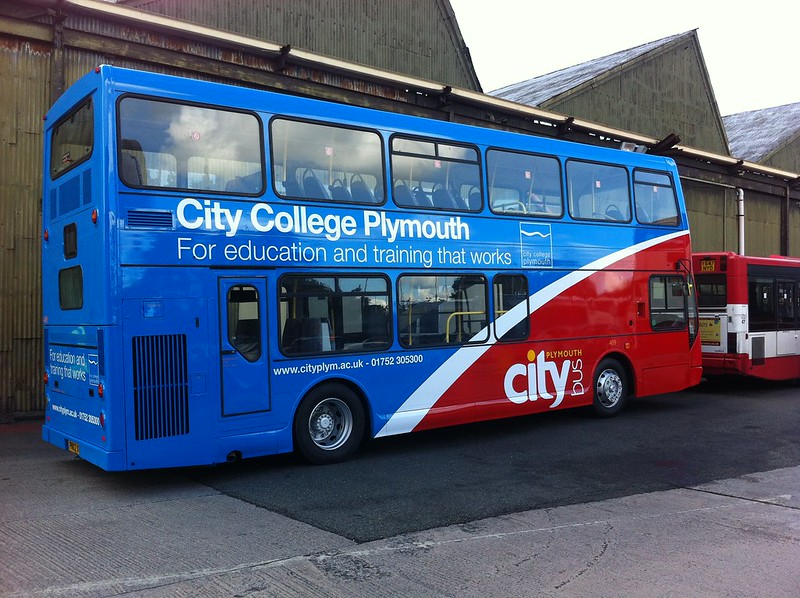
©M Collins - Plymouth Citybus.
Bloggers
- fbb is not proficient in Danish but, clearly, "vest" is "west, "ost" is "east" and, delightfully "syd" is "south"; but don't tell him. As "nord" is "north", we have to assume that "midt", which doesn't reveal itself in the on-line Danish to English dictionary is the same as "midte" meaning "middle". Public Transport Experience
- Arriva Buses Wales has announced the withdrawal of the X32 Bangor to Aberystwyth service, blaming falling passenger figures for the cut. It represents another blow to the TrawsCymru network that, until a few years ago, was promoted as a Welsh Assembly Government-led solution to the problems of long distance travel, especially from North to South Wales. Omnibuses

I think that the blue with a small area of red looks good. In this case applying a white “swoop” does create a good transition between the two colours. But once again, however, why do they apply the swoop to an area of the glazing? Again, I suppose it is only my opinion, but this gives to me the impression that Citybus have a greater regard for their livery than they do for the bus passengers, who after all are their customers. I am sure that they would not be permitted to do this on the driver’s window, so common courtesy I feel is that they should not obscure the passenger windows either.
ReplyDeleteI partly agree with the comments above, this version of the new livery is so much better than the drab red liveries that have been used prior
ReplyDeleteI quite like this. Thought it would be terrible when I saw 408 out with just red and blue, but it has come off pretty well. As for the swoop, I kind of think it doesn't matter a great deal.
ReplyDeleteIts a huge step forward from the days where an AOA literally was All over! Struggling too see out of the windows was an issue then!!
I know in this case the “swoop” does not cover a particularly large area of the windows. It may also be argued that most of it is by non-seating areas, however, I still think it is bad practice to cover windows in this manner. For a start, to me, it looks peculiar from inside the vehicle to have a white “swoop” going over the glass. Surely it must be possible to design a livery scheme which covers only the bodywork and not the glazing? It just seems wrong for the livery to “trespass out” onto the windows in this way. Also, again to me, it gives the impression that this new livery totally disregards the passengers who are actually travelling on the bus. Anyway rant over and of course it is just my own personal opinion. In all other respects the new liveries are excellent and should bring a fresh new image to Plymouth Citybus.
ReplyDeleteWhat a wonderful blog about car! I found lots of helpful tips for my car. Just bookmark your blog for more explore!
ReplyDeleteWhat a wonderful blog about car! I found lots of helpful tips for my car. Just bookmark your blog for more explore!
ReplyDeletepicture the design with the swoop just on the bodywork and not the glass? it would look stupid! by having a continuous swoop adds to the effect. at least its not an aoa version which did cause problems. and anyway the majority of passengers are to ingrossed in their moblie phones to look out the windows!!!
ReplyDeleteCertainly enhances the swoop livery. Will we see some more route branding based on this principle. Perhaps some green relief for the 5/5a evoking memories of Western National in Plymstock.
ReplyDeleteLooks good. Although I broadly agree with the sentiments about keeping liveries off the windows this application does try and minimise it. It's not exactly in contra-vision territory is it?
ReplyDelete