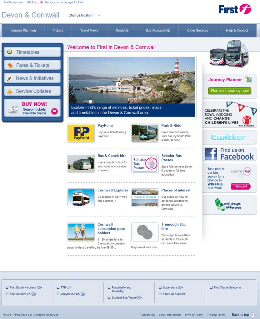
The Home Page
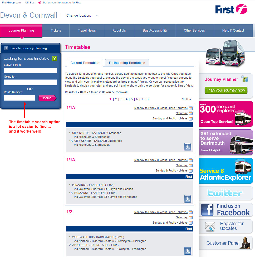
So how good are the timetables?
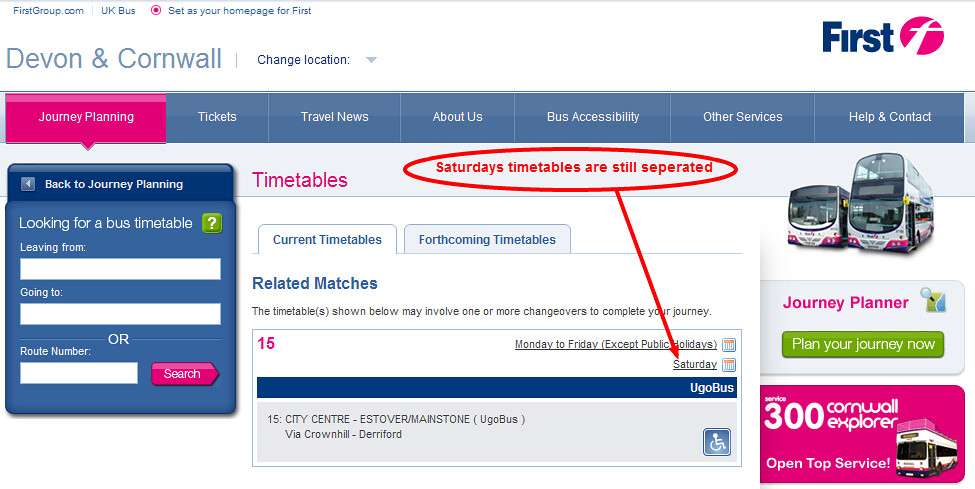
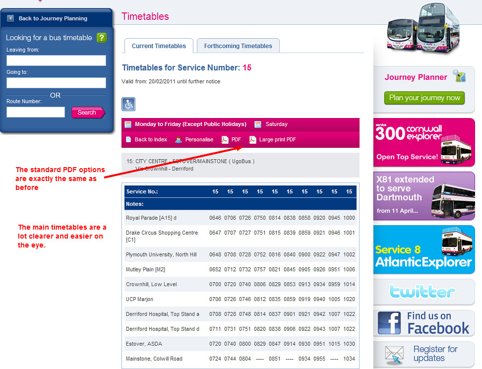
Its the first time I have seen the personalise timetable link actually working:
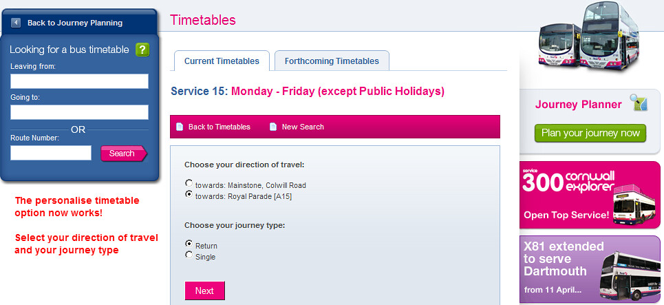
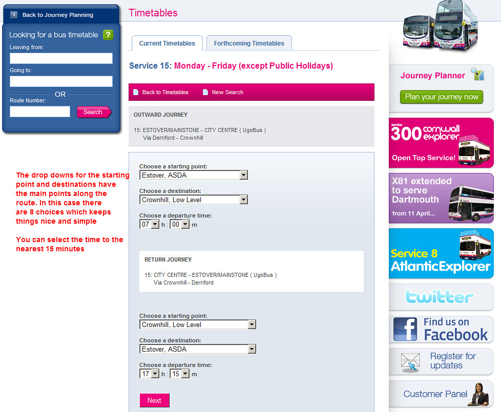
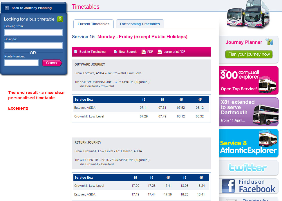
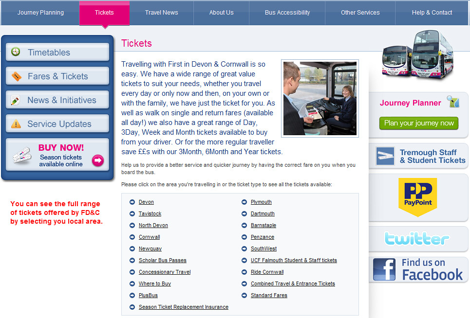
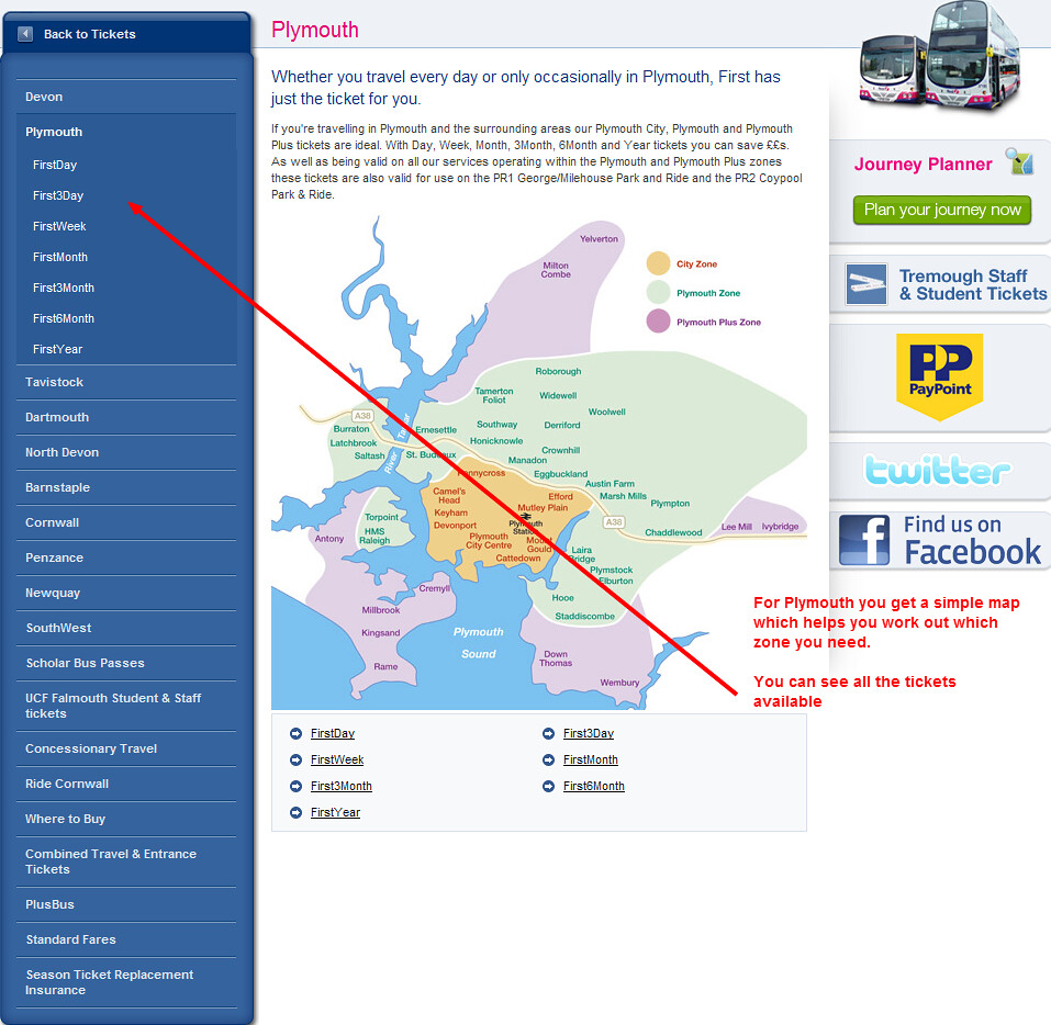
What about Tickets then?

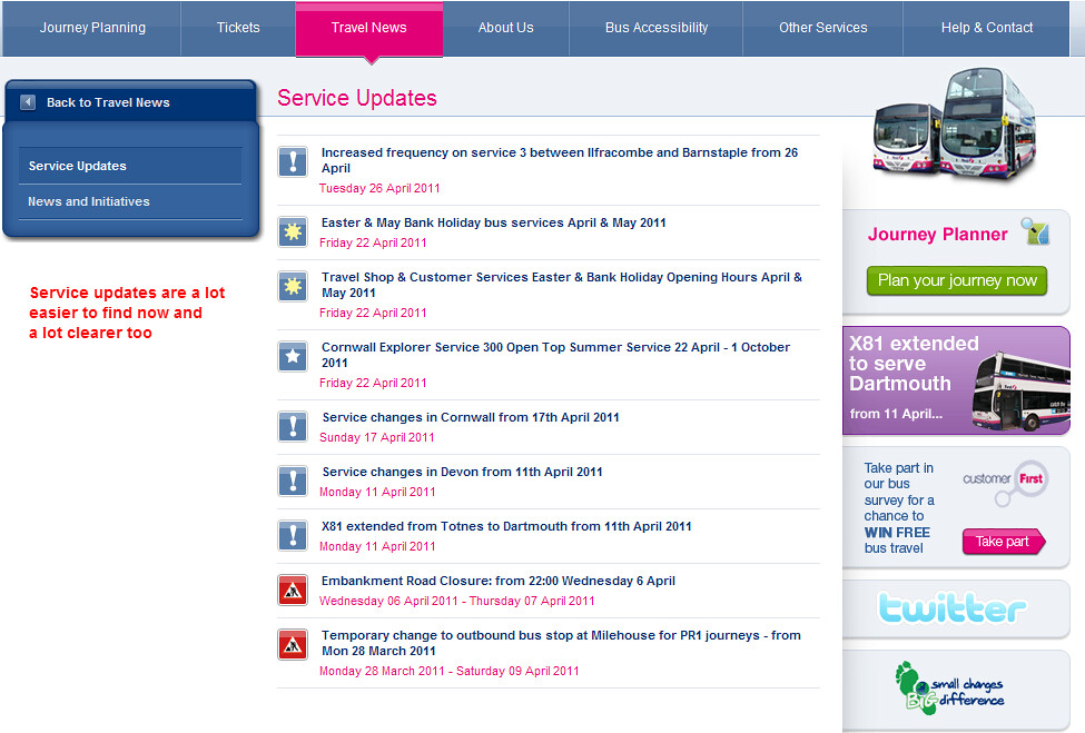
Finally lets end with service updates:
All in all its a very clear design which is both easy on the eye and very easy to find your way around. I like the current Plymouth Citybus web site a lot but I have to say I find this new First design even better. Its certainly light years ahead of the older First design which is still in use by a lot of the local areas including Hampshire.
Elsewhere on the net
- Well these little 709s looked like they'd survive forever in the hands of Stagecoach, certainly surpassing many people's expectations for time in service. PTOTPA
- Civil Disobedience at Wellingborough! Public Transport Experience
- You have to think very carefully when you mess around with child fares. Following the significant changes to TfGM’s child concessionary tickets, First Manchester probably thought it had no option. But the publicity and ill feeling it generates aren’t always worth it. Omnibuses
- For the first time in about three years, I did a long visit to Portsmouth yesterday, hopping around the city to get lots of photos Southern England Bus Scene

My reaction is not that of the blog's author. What a complex and uninviting mess this website is. The internet was designed (Good old Tim Berners-Lee) to communicate information quickly and simply. Now we have to plough through huge amounts of stuff just to find, say, a ticket price. Too mmuch clutter, too many little graphics to slow downloading, too much on a page and the intrinsic information is too complex to start with. Does the world really need SO MANY fares for one city?
ReplyDeleteI spotted this yesterday..I have to say I like it..very modern and nice fresh look!!
ReplyDeleteMakes the Citybus new site look a bit sad and jaded now doesn't it ???